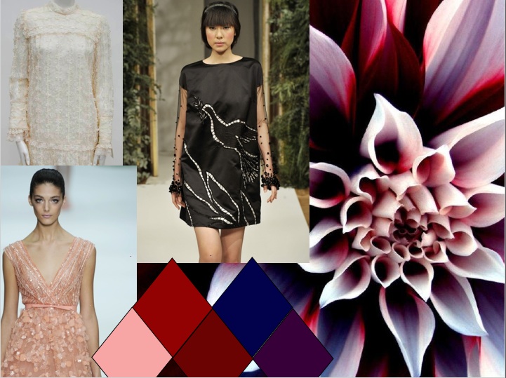
I call this one Dahlia, it's inspired by dramatic floral colors and vintage dresses- there's lots of texture and relaxed shapes with a cool, rich color palette. I saw a lot of texture on the haute couture shows and thought it was really inspiring and feminine.

This is my grey and yellow story- it's my favorite color combination and I'm starting to see a lot of yellow everywhere, which makes me happy- I think grey and yellow are a nice duality because yellow is a happy, vibrant color and grey is a subtle, more low-key neutral so they're very different but harmonious.
What do you think of my storyboards? Which do you like best? One of them will be turned into a collection!
These are really snazzy. I enjoy the different shapes for your color stories and the boards themselves are so clean and simple.
ReplyDeleteGray has become my new favorite neutral, and I am loving it with all manner of bright colors - yellow, pink, cobalt, etc. I love your color combos on both boards!
ReplyDeleteBeautiful story boards! I am drawn toward subtle elegance and the blue and yellow dress from your second board is exceptional.
ReplyDeleteI love them both, but my favorite is the grey and yellow one. I love subtle neutrals with a pop of color! Now I know what to wear today. :)
ReplyDeleteI agree. Yellow is getting alot of play lately. When trendspotting, I noticed quite a bit of yellow accents, but as a main color this story would be interesting.
ReplyDeleteI really like how you showed your color palette. Also I thoroughly agree about yellow and grey being a great color combination. It is sadly overlooked far too often.
ReplyDeleteI love them both, but the Dahlia storyboard immediately stood out to me. The name (Dahlia) is striking and memorable and correlates nicely with the story set. Lace has a very romantic feel to me, and the floral aspect makes the story all the more feminine.
ReplyDeleteYellow and gray go very well together. I appreciate you doing this, complementing two very unlikely colors so smoothly!
The yellow pops against the gray; attention-grabber!
Both storyboards are great, but I love the grey and yellow color story. I think that one in particular would make a great collection, especially because of the unusual silhouettes.
ReplyDeleteI love your second storyboard because I'm a huge of fan of warm greys with citrus colors. Solid colors with subtle prints work well with each other and are represented well on your storyboard!
ReplyDeleteI think the way you arranged your color stories was very clever!
ReplyDeleteI like how you kept both boards clean and easy to read and the mixing of grays and yellows is fun and fresh which I think would be perfect for clean lines.
ReplyDeleteYellow and grey is so you, haha. Love it. Its a very uncommon color combination and I would love to see it turned into a collection!
ReplyDeleteThe dahlia is my favorite! I love that flower and the colors you pulled from it.
ReplyDeletei love the organic feel of your second story board. The Yellow tones are so vibrant and beautiful they really showcase your story board
ReplyDeleteFIFTEENTH COMMENT YEEEAAAH! mmkay sorry had to get that out. on another note, your color palettes are gorgeous. you did a brilliant job providing a connection between the silhouettes and inspirations, they make a gigantic amount of sense.
ReplyDeleteI like your pop of yellow storyboard, I really like the dress on the far left. I agree, yellow has definitely been popular on the runway.
ReplyDeleteI like the shapes of the first board. I think the choice of putting that flower on the board was a really great artistic move. The flower really draws people in because of how different it is. It is very interesting.
ReplyDeleteBoth boards are nice, but I prefer the Dahlia board -- it lends itself to more inspiration/concepts/shapes . The yellow board looks very interesting, but I think it is difficult to design with a color as the inspiration -- but then again-- yellow does having meaning....
ReplyDelete